


The Motley Mom Life is a raw, relatable, and deeply supportive space for families navigating the challenges of special needs and disabilities. This blog offers clarity, encouragement, and practical tools to help parents and caregivers embrace their journey with confidence. Backed by firsthand experience, it offers both the honesty of lived struggles and the hope of thriving beyond them.
The brand identity for The Motley Mom Life was carefully chosen to reflect the heart of the brand—raw and approachable. The stained-glass window icon and logo suite was designed to reflect the multi-faceted reality of life, showcasing the beauty and complexities of life with special/diverse needs. The typography selected adds a personal, heartfelt touch, making the brand feel like a trusted friend rather than a clinical resource. The structured yet airy layout of the website keeps the content digestible, reducing overwhelm while inviting users to explore resources with ease.
The Project Scope
Mission, Vision, Core Values
Unique Value Proposition
Single-minded message
Tagline
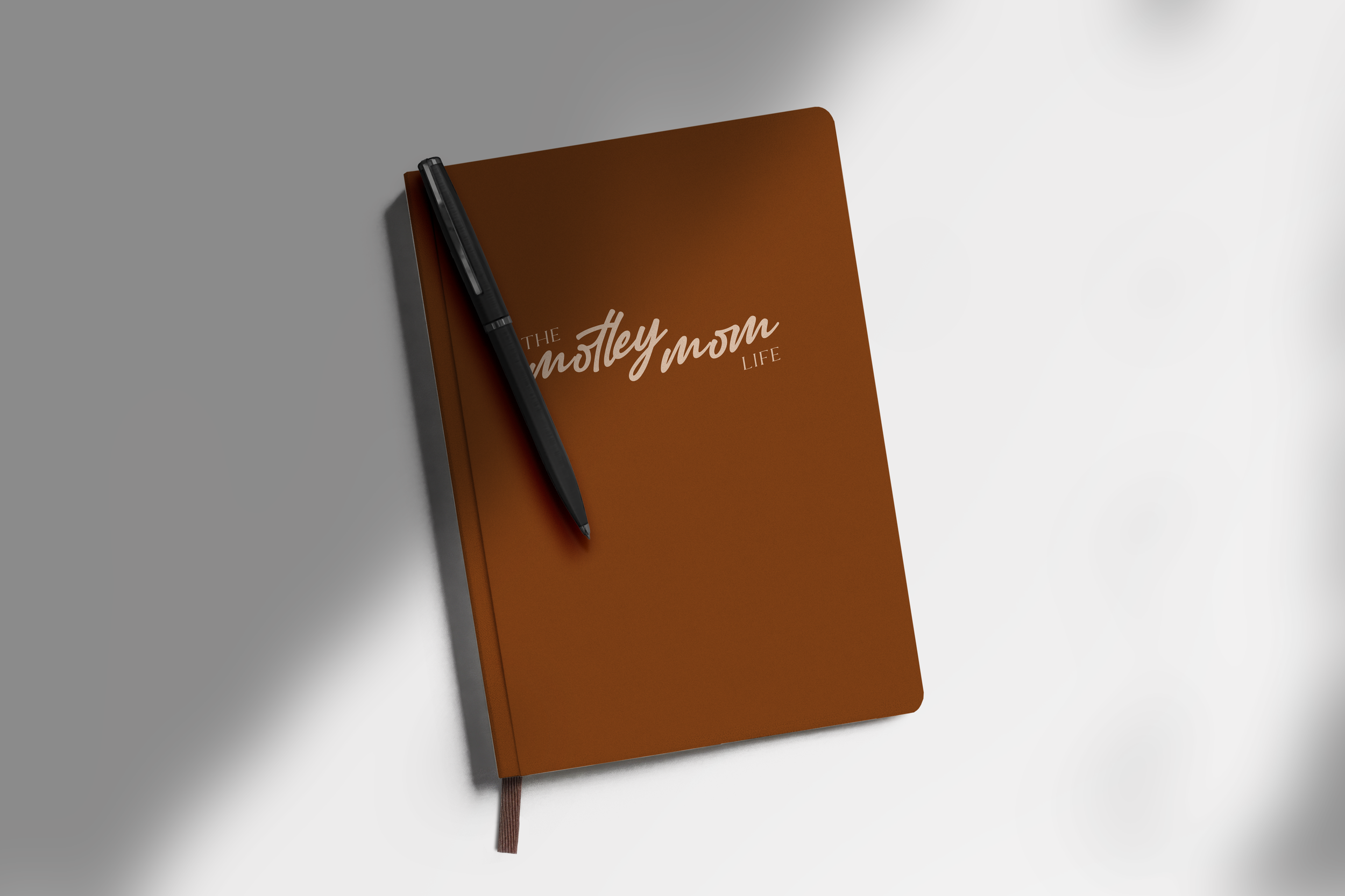
Primary Logo
Secondary Logo
Icon
Color Palette
Typography System
Copywriting
Brand Guide
5-page Showit Website
Blog Integration
DESIGNER: Abby Grace Meads
CLIENT: The Motley Mom Life
PHOTOGRAPHER: Kate Brooks Photography


Counseling with Maury Jo
Abby O Photo
"I have worked with so many firms over the past 30 years and she was by far the best."
“My favorite part of working with Abby Grace was her attention to detail. There is an art to websites and marketing, and I would recommend her to a friend for her expertise and quality of work.”
Clayton C. | R1:16 Ministries
You only get one shot at a first impression.
Ready to reach the right people and expand your impact? Let’s talk.