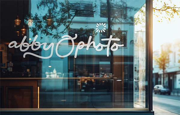

Abby O Photo is a high-end wedding photography business that captures life’s most radiant moments with elegance, artistry, and heart. As Abby leaned fully into the luxury wedding space, it was time for a brand that reflected the elevated experience she offers—without losing the raw, joyful personality that makes her work so uniquely hers.
This rebrand strikes that balance with intentional detail. The logo suite features a sophisticated script font—elegant and flowing, yet full of personality. It brings a handcrafted, human feel to the brand while still holding its own in the luxury space. The bold, professional color palette reinforces the high-end positioning, while allowing the brand to feel fresh, modern, and full of life.
The result is a visual identity that meets high-end expectations but still feels human—because luxury doesn’t have to be still. It can move, breathe, and laugh right alongside the stories it tells.
The Project Scope
Primary Logo
Secondary Logo
Alternate Logos
Illustrations
Color Palette
Typography System
Brand Guide
DESIGNER: Abby Grace Meads
CLIENT: Abby O Photo


"I have worked with so many firms over the past 30 years and she was by far the best."
“My favorite part of working with Abby Grace was her attention to detail. There is an art to websites and marketing, and I would recommend her to a friend for her expertise and quality of work.”
Clayton C. | R1:16 Ministries
You only get one shot at a first impression.
Ready to reach the right people and expand your impact? Let’s talk.


